Psychology of Color - Corporate Interiors
Colors are all around us – in the clothes we wear, in the food we eat, and in the environments we inhabit. As a designer, I have always been fascinated by colors and the effect they have on people. One of the first questions I ask someone when I first meet them is, “what is your favorite color?” Just like each person has their own personality and characteristics, so does color. Certain colors like red and yellow make bold statements, while cooler colors such as green and blue are more relaxing. In a world where people spend more time at work than in their homes, the environments that we work in have a bigger effect on us than we realize depending on the colors that surround us.
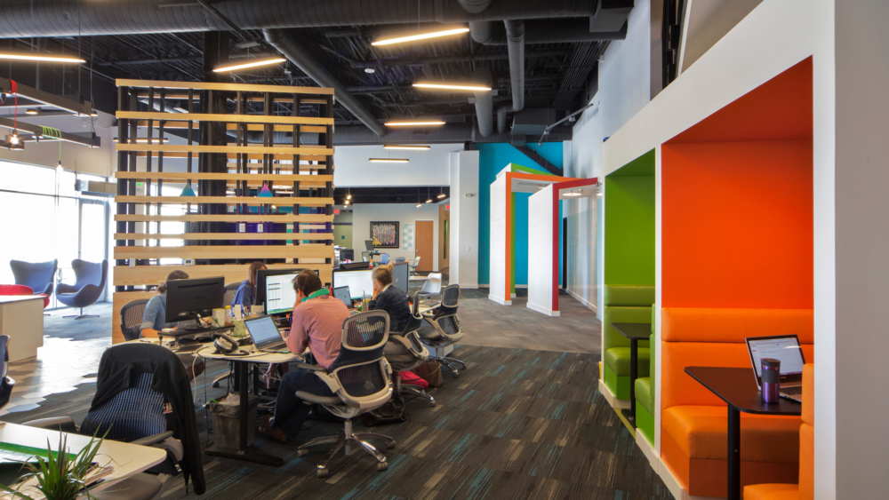
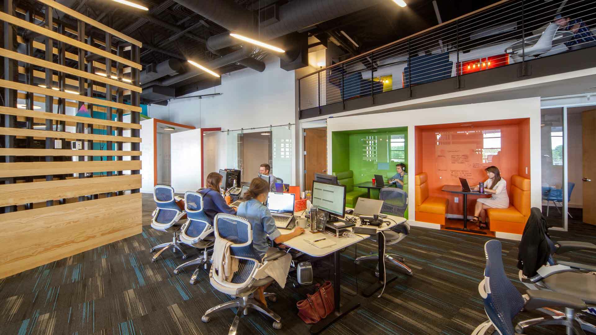
Colors influence how a person feels, how productive they are throughout the day, and even their physical health. For example, walls that are blue or green encourage relaxation, and have been proven to lower heart rates and blood pressure, as well as reduce anxiety. Green is also easy on the eyes, which is extremely beneficial for employees who look at computer screens all day. In contrast, bright colors such as yellow and orange bring energy to the room, causing excitement and enthusiasm. These colors also encourage creativity and collaboration, making it great for meeting and social spaces in an office.

Often, people gravitate toward neutral colors and shy away from using color in a space. There are a lot of benefits to using neutral colors such as white, gray, brown, and black. They can give a clean, modern look to any space. However, too many neutral colors of the same tone or value can quickly de-energize a room. Without any stimulating colors, employees will feel less motivated and inspired to do their work, and will most likely look back on their day with negative emotions. An all neutral palette seems easy, but it is actually quite difficult to achieve balance stimulation for our sense of well-being. Special attention to details, texture, contrast from light to dark values, as well as mixing in natural elements such as wood tones and metals can help create interest with a neutral palette.
While color is an important part of any space, too much of it can be just as harmful as not using any color at all. Using a mixture of neutral and chromatic colors will dramatically define the workplace. For example, using a company’s brand is a great way to incorporate color in a space without overwhelming it. Having colorful accents in feature graphic walls, signage, lighting, furniture, and art throughout the office environment can act as an extension of the company’s identity, as well as improving the lives and productivity of the employees who work there.
Call me an idealist, but I like to imagine a world where people feel happier in the spaces they work in. By adding a splash of color on some walls, I think it will add a splash of color in our lives.